2020. 7. 8. 16:41ㆍML in Python/Python
LDA/QDA는 간단하게 말해서 집단간의 분산대비 평균의 차이는 최대로 하는 Decision Boundary를 찾아내는 방법이다.
자세한 직관적 이해와 수학적 원리는 아래 링크를 통해 학습하기 바란다.
https://todayisbetterthanyesterday.tistory.com/25
[Data Analysis 개념] LDA와 QDA의 이해
*아래 학습은 Fastcampus의 "머신러닝 A-Z까지"라는 인터넷 강의에서 실습한 내용을 복습하며 학습과정을 공유하고자 복기한 내용입니다. LDA는 간단하게 말해서 집단간의 분산대비 평균의 차이는
todayisbetterthanyesterday.tistory.com
이 게시글은 Python을 통한 실습 과정만 존재한다. 과정의 순서는
1. 기본적인 LDA(Linear Discriminant Analysis) 구현
2. 기본적인 QDA(Quadratic Discriminant Analysis) 구현
3. LDA와 QDA를 시각적으로 비교
순으로 진행된다.
1. 기본적인 LDA(Linear Discriminant Analysis) 구현
# 필요 라이브러리 import

import numpy as np
from sklearn.discriminant_analysis import LinearDiscriminantAnalysis
# 기본 실습에 사용할 간단한 가상 데이터
X = np.array([[-1,-1], [-2,-1], [-3,-2], [1,1], [2,1], [3,2]])
y = np.array([1,1,1,2,2,2])# 기본적인 LDA 구현
clf = LinearDiscriminantAnalysis()
clf.fit(X,y)
사실 sklearn에 존재하는 모델들은 기본적으로 학습 형태가 같다. 모델학습을 위한 모델을 실행시킨다음, 갖고있는 DataSet을 Feature와 Target으로 분리하여 fitting을 실행시킨다.
이 과정은 LDA/QDA뿐만 아니라, 단순/다중 선형회귀분석, 로지스틱, PCA, 나이브베이즈 등에도 동일하게 적용된다.
# 가상 데이터 예측

clf.predict([[-0.8,-1]])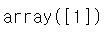
위의 데이터는 X,y로 LDA를 진행하였을 때, 학습된 결과로 새로운 데이터를 예측한 것이다. (-0.8,-1)이라는 데이터는 범주 1로 예측을 하였다.
2. 기본적인 QDA(Quadratic Discriminant Analysis) 구현
사실 기본적인 과정은 LDA와 동일하다. 다시 한 번 진행해보도록 하겠다.
# 필요 라이브러리 import

from sklearn.discriminant_analysis import QuadraticDiscriminantAnalysis
# 기본적인 QDA 구현
clf2 = QuadraticDiscriminantAnalysis()
clf2.fit(X,y)
# 가상 데이터 예측

clf2.predict([[-0.8,-1]])
위의 간단한 예제에서는 LDA와 QDA를 통한 분류가 동일한 결과를 발생시켰다. Confusion matrix를 통해서 두 모델의 정확도를 확인해보자.
# LDA와 QDA를 Confusion matrix를 통해서 비교

from sklear.metrics import confusion_matrix

# LDA confusion_matrix
y_pred = clf.predict(X)
confusion_matrix(y,y_pred)
# QDA confusion_matrix
y_pred2 = clf2.predict(X)
confusion_matrix(y,y_pred2)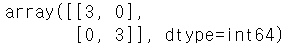
위를 보면 예제가 너무 단순해서 그런지, 완전하게 동일한 결과를 낳았다. 하지만 LDA와 QDA는 Decision Boundary의 형태가 매우 다르다. 이를 확인하기 위해 새로운 데이터셋으로 시각화하는 작업을 진행하고자 한다.
3. LDA와 QDA를 시각적으로 비교
# 필요 라이브러리 import

from sklearn.datasets import make_moons, make_circles, make_classification
from matplotlib.colors import ListedColormap
from sklearn.model_selection import train_test_split
from sklearn.preprocessing import StandardsScaler
import matplotlib.pyplot as plt
## 시각화 비교 작업

h = 0.2
names = ["LDA", "QDA"]
classifiers = [ LinearDiscriminantAnalysis(), QuadraticDiscriminantAnalysis()]

# DataSet 로드 & X,y 분리
X,y = make_classification(n_features = 2 , n_redundant = 0, n_informative = 2, random_states = 1, n_cluster_per_class = 1)

rng = np.random.RandomState(2)
X += 2*rng.rng.uniform(size = X.shape)
linearly_separabl = (X,y)

datasets = [make_moons(noise = 0.3, random_state = 0, make_circles(noise = 0.2,factor = 0.5, random_states = 1), linearly_separble]

figure = plt.figure(figsize=(27,9))
l = 1

for ds in datasets :
    X,y = ds
    X = StandardScaler().fit_transform(X)
    X_train, X_test, y_train, y_test = train_test_split(X,y test_size = 0.4)

    x_min, x_max = X[:,0].min() - 0.5, X[:,0].max() + 0.5
    y_min, y_max = X[:,1].min() - 0.5, X[:,1].max() + 0.5
    xx,yy = np.meshgrid(np.arange(x_min,x_max,h), np.arange(y_min,y_max,h))

    # DataSet plot
    cm = plt.cm.RdBu
    cm_bright = ListedColormap(['#FF0000', '#0000FF'])
    ax = plt.subplot(len(datasets), len(classifiers) + 1, i)

    # Traing point plot
    ax.scatter(X_train[:, 0], X_train[:, 1], c=y_train, cmap=cm_bright)

    # Testing point plot
    ax.scatter(X_test[:, 0], X_test[:, 1], c=y_test, cmap=cm_bright, alpha=0.6)
    ax.set_xlim(xx.min(), xx.max())
    ax.set_ylim(yy.min(), yy.max())
    ax.set_xticks(())
	ax.set_yticks(())
    i += 1

    for name, clf in zip(names, classifiers):

        ax = plt.subplot(len(datasets), len(classifiers) + 1, i)
        clf.fit(X_train, y_train)
        score = clf.score(X_test, y_test)

        # Decision Boundary마다 색을 부여
        # point in the mesh [x_min, m_max]x[y_min, y_max].

        if hasattr(clf, "decision_function"):
            Z = clf.decision_function(np.c_[xx.ravel(), yy.ravel()])
        else:
            Z = clf.predict_proba(np.c_[xx.ravel(), yy.ravel()])[:, 1]

        # Color plot에 결과 넣기 - 기존 DataSet
        Z = Z.reshape(xx.shape)
        ax.contourf(xx, yy, Z, cmap=cm, alpha=.8)

        # Color plot에 결과 넣기 - Training set
        ax.scatter(X_train[:, 0], X_train[:, 1], c=y_train, cmap=cm_bright)

        # Color plot에 결과 넣기 - Test set
        ax.scatter(X_test[:, 0], X_test[:, 1], c=y_test, cmap=cm_bright,
                   alpha=0.6)

        ax.set_xlim(xx.min(), xx.max())
        ax.set_ylim(yy.min(), yy.max())
        ax.set_xticks(())
        ax.set_yticks(())
        ax.set_title(name)
        ax.text(xx.max() - .3, yy.min() + .3, ('%.2f' % score).lstrip('0'),
                size=15, horizontalalignment='right')
        i += 1

figure.subplots_adjust(left=.02, right=.98)
plt.show()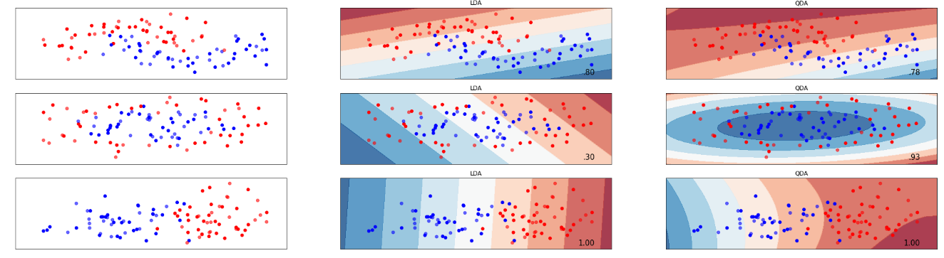
위의 출력 plot을 보면 왼쪽이 데이터셋 산점도, 가운데가 LDA의 Decision Boundary를 나타낸 결과물, 오른쪽이 QDA의 Decision Boundary를 나타낸 결과물임을 확인할 수 있다. 2번의 QDA가 LDA보다 현저하게 높은 분류결과를 가져온다는 것을 제외하고는 LDA와 QDA중 어떤 방법이 더 낫다라는 단정을 짓지 못한다.
즉, 이는 데이터의 분포 상태에 따라 달라질 수 있다는 것이다. 그렇기에 다른 분석과 마찬가지로 데이터의 사전 검토작업이 꼭 필요하다.
'ML in Python > Python' 카테고리의 다른 글
| [Python] 의사결정나무(DecisionTree) 구현 - 분류(Classifier)/회귀(Regressor)/가지치기(Pruning) (4) | 2020.07.18 |
|---|---|
| [Python] SVM(Support Vector Machine)구현 실습 (1) | 2020.07.16 |
| [Pyhon] KNN(K-Nearest Neighbors)알고리즘과 Cross-Validation을 통한 최적의 K찾기 실습 (0) | 2020.07.04 |
| [Python] Gaussian/Multinomial Naive Bayes Classification(가우시안/다항 나이브 베이즈 분류) 실습 (0) | 2020.07.02 |
| [Python] - PCA(주성분분석) 실습 (0) | 2020.06.30 |